The Continuous Improvement Champion of the Year (CICY) logo was my entry in a company-wide contest at General Mills. The Continuous Improvement (CI) team wanted a logo for their annual awards ceremony and presented the design challenge to all employees in the company.
The existing CI logo was a complex graphic that featured a classic Greek architectural structure with a pediment, multiple pillars, and steps. The CICY logo contest allowed for reinterpretation of the existing CI design or a brand new concept. I chose to simplify and reduce the existing logo down to one element: a single Doric column with the CI initials. I felt that the column was a logical representation of the fundamental pillars of CI and it acknowledged the structure and foundation of CI.
In addition to the “Continuous Improvement Champion of the Year” title text, a tagline/theme was also requested for the awards ceremony. I submitted the theme: “Building on a foundation of Success.” This tagline implied the idea that CI was a successful program, the foundation for CI was set and it would continue to evolve throughout the coming years.
I won the contest and my CICY logo was used on printed materials, email communications, clear lucite award trophies, and intranet websites. After the awards ceremony, the corporate CI team decided to adopt my design for the entire CI program. The “Champion of the Year” text was removed from the logo and the single pillar was adopted as the new logo for CI.
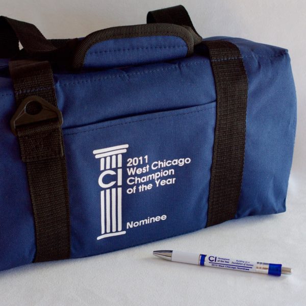
The CI Manager at the West Chicago also requested a slight modification of the CICY design for branding on some prize giveaways. Custom text and a blue background were added for that design adaptation.

